Introduction
Last week, we published an interactive about how American workers can be legally exposed to dangerously high levels of carcinogens and other toxic substances, and where the regulation is lacking. We would like to share some of the challenges we went through during the conception and creation of the interactive.
Make data relatable to people
When we got the data, it was just a series of chemicals with alarmingly high cancer risks. We had no idea what those long chemical names stood for and who should be worried. It was hard to imagine anyone who saw the visual representation of it would be able to relate to it. We realized that it would be crucial to find out more information about the chemicals in order to make this visualization useful to people at all.
We put a lot of efforts into finding out where these chemicals are used and which industries are exposing workers to them. We relied on government sources including the Agency for Toxic Substances and Disease Registry, the EPA and in most cases, OSHA sampling data taken by inspectors at workplaces. Our findings were far from exhaustive, but it at least put the data into perspective and could inform workers in particular industries and sectors of potential harm.
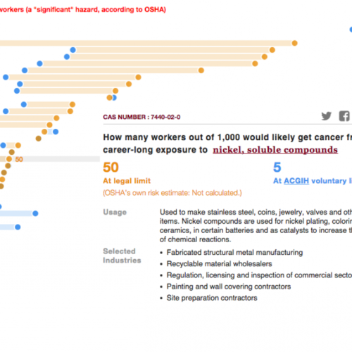
In the end, the graphic itself served as a navigation to explore the 44 carcinogen chemicals.
Convey uncertainty without confusing the readers
No dataset is perfect. Often we struggle to find the best way to present the data elegantly while explaining the limitations.
In our cancer risk visualization, we wanted to show the risk per thousand workers in a single clear number. But we had different numbers from different sources for a handful of chemicals. How can we be transparent about the estimated risk without confusing our readers with different numbers?
The cancer risk graphic is based on an analysis by Adam M. Finkel – a former OSHA official now at the University of Pennsylvania Law School – and the Center for Public Integrity.
It shows how many workers per 1,000 would likely get cancer after 40 years of exposure to a chemical at exactly the legal limit. The analysis relied on cancer-risk figures developed by the U.S. EPA and California’s EPA. For a handful of substances, OSHA has its own cancer risk estimates. OSHA’s assessments consider the way a substance’s risk varies as exposure levels change, which might make them more accurate than Finkel’s study. However, most of OSHA’s estimates are more than two decades old and might not reflect up-to-date research.
We wanted to show readers both of these figures so to not hide any information that is different from the study we featured.
We went through many iterations of this graphic. At one point, we had people toggle between two graphics in order to perform apples to apples comparison. By that point, the main idea that federal limits are not protecting workers from high cancer risks, was getting lost in the shuffle. We ended up noting the OSHA’s estimate alongside our calculations, instead of including it within the graphic. This way, readers can focus on the most important information and also have additional information if they are interested.
Accessibility on mobile
More than 50% of our traffic comes from mobile, so we wanted to make the interactive equally accessible to this significant slice of readers. Making the interactive completely responsive was not enough, as it was impossible for mobile users to click on very small areas and navigate through the interactive.
We initially had a line which people could drag to locate one chemical. That didn’t work out well as dragging a line vertically is not a gesture that mobile users are trained and it interferes with the scroll gesture that people are most tempted to use.
Eventually, we rotated axes 90 degrees and had a completely different design for mobile and tablet. People can navigate through the interactive by simply clicking left and right arrows on the screen and also filter the chemicals by sector.
Accuracy, clarity, relatability: how did we do?
We know that the most important thing for a data visualization is to get it right. During the process of producing the interactive, we were constantly in touch with experts, officials and scholars in the field to try to ensure accurate representation of the data. Beyond its accuracy, we were most concerned with helping the data be as effective as possible by making it clear and navigable.
Did you find the interactive relatable? Were the cancer risk numbers confusing to you or was this easy to understand? We would love to hear about your experience with the interactive and suggestions for the future.
If you would love to tell us more about how we did, please get in touch at yqiu@publicintegrity.org or leave a comment below.
Editor’s note, July 8, 2015: Read How journalists visualized cancer risk from workplace chemicals from Storybench.

Join the conversation
Show Comments