Introduction
Fatal Extraction is the story of Australian mining’s vast but rarely-examined social and environmental footprint in Africa.
Over the course of 18 months, journalists from the Center for Public Integrity and the International Consortium of Investigative Journalists, working with more than a dozen reporters across Africa, collected data, documents, video footage, and largely unheard witness accounts that uncovered links between Australian-listed mining companies and allegations of negligence, violence, environmental law-breaking, and other behaviors that would never be tolerated in better-regulated jurisdictions.
With an abundance of rich materials, the team faced a significant challenge: how to present it all in a compelling way that would allow audiences to explore a variety of content as they engaged in a much larger narrative. The end result is an immersive multimedia feature incorporating strong human stories with stunning visuals, rare documents and innovative data analysis to reveal the extensive and sometimes deadly impact of Australian mining companies in 33 African nations.
Here, multimedia editor Eleanor Bell and news developer Chris Zubak-Skeesdiscuss the making of the Fatal Extraction multimedia project.
Q. Why did you choose this storytelling mode for the story?
Eleanor Bell: Initially, we intended to package our Africa multimedia into four separate video stories broken down by country. During filming, it became clear listening to our sources, on-camera and off, that there was a great deal of crossover in their experiences dealing with the practices of Australian-listed mining companies operating in Africa.
Lead reporter Will Fitzgibbon had uncovered a mountain of primary source documents and recordings. We also had a powerful data story, hundreds of hours of footage and multiple memory cards of images from some of the most visually stunning places on earth. These artifacts could be coerced into a video timeline or added as sound files, video stories and documents to a traditional text piece. But with so much unique material, there was an opportunity to allow the content to tell the story.
Our aim was to integrate all the elements into a “digital” experience that would deliver a compelling story without sacrificing the nature of the material. In short, we wanted to deliver these stories in their most organic form. We looked to NPR’s Borderlands and Demolished projects for inspiration. These are highly visual, engaging narratives that encapsulate the idea that stories can be “of the web and not just on the web.”
Chris Zubak-Skees: We could have packaged this with a written narrative, but we wanted the multimedia to tell the story, not supplement the story.
This format had the benefit of being tested (by outlets like NPR) for immersive multimedia storytelling, which is what we wanted. It lets the viewer process the story in discrete chunks, which has both pluses and minuses. It lets them choose their own pace and find shareable moments. But clicking through can feel like a chore if you don’t make it feel fluid. Could we make this feel like something more than a slideshow or a PowerPoint presentation?
Q. What are the strengths and weaknesses of the different media — and how did you decide which to use for each part of the story?
EB: This is an inherently complex story, and prevailing wisdom often says that the best video stories are discreet and simple. Part of this project was about seeing how far we could push the medium. That meant creating a linear narrative, incorporating a documentary-style arc rather than a faceted multimedia presentation.
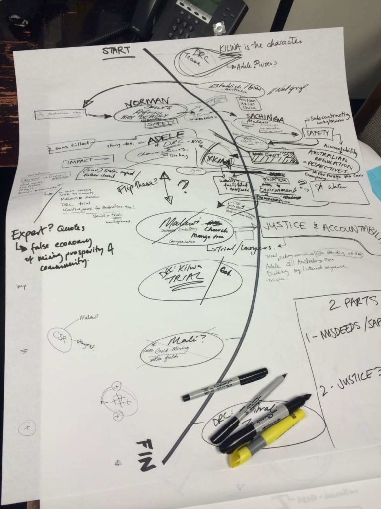
An earlier version had a series of video assets in the first few slides but we needed the nature of the different media to be immediately apparent to the audience. I felt that this would set the stage for the user experience. We tried to use the most appropriate form for each part of the story. If we had good video, we used video, if we had a quote we made it a quote, if we had data, we turned it into a graphic.
CZS: Making inline video work well on mobile was a huge challenge. Many organizations opt instead for showing an image or text on mobile devices in place of video. Because the presentation was so video-heavy, though, we wanted to preserve that experience, if possible. To accommodate video in a landscape orientation, we tilted the presentation so viewers would have to holdtilt their devices horizontally to see it. We also had to work around limitations on the iPhone operating system, which weren’t ideal.
We made great strides in making it work well, but there’s still more we could have done. Would portrait video have worked better for these devices? Is video the best medium for slower mobile networks and devices? Would a different format have worked better? These are the questions we asked while building this, and many are still open.
Q. How concerned were you both about keeping the audience, and what steps did you take to keep the viewer invested and continuing to click through?
(Kimberley Porteous/Center for Public Integrity)
CZS: We were very concerned. Eleanor and Will spent a lot of time editing the narrative. We used a modified script in a Google Doc, which anyone on the team could edit, to populate the presentation. If an editor added, rewrote or changed the order of slides, we could preview that change instantly on a preview site. It was a process which allowed us to improve the presentation collaboratively.
I also spent a lot of time worrying about load time. The images and video load one slide before a user sees it. We re-encoded the videos at several different sizes, and the presentation loads the appropriate video format for the device and size of screen.
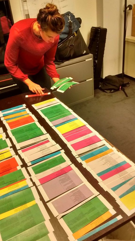
EB: During scripting we made sure to consider both the medium and the material. That meant balancing graphics and still images against the deeper personal stories of our sources told through vignettes and the use of video loops. I worked by color coding the different assets so that we could see, at a glance, how that balance shifted.
Even though the audience is essentially reading the story, they are experiencing it too. Data from outlets like NPR show that audiences love slideshows. But with 90 slides, I felt we had to keep the mini vignettes really tight so they would fit seamlessly into the wider narrative and allow the audience to advance quickly through the story.
Q. Does the multimedia approach allow you tell aspects of the story that the text report didn’t allow?
EB: Rather than recycle the broadcaster-as-all-knowing-expert format you see so often in TV news, the mini vignettes allowed our sources, often from remote communities across Africa, to share their stories and experiences with the world in their own words.
The looped footage acts as ‘moving pictures’ that transport the audience to the scene, letting them experience a little of life in Mali, South Africa, Malawi and the Democratic Republic of Congo that often illustrates the issues highlighted in the words on screen.
CZS: I suppose most of this could have been told in text, but the multimedia is a chance to connect with viewers on a personal, dare I say, emotional level.
Q. What are your favorite parts of the story?
EB: Adele Faray-Mwayuma’s story really connected. She’s a very warm person and also very strong. On some of the days we were filming, she was fasting, and yet she was very patient even when we delving into the most traumatic chapters of her life. To not know where your children are buried or how they were killed – I can’t imagine losing my family in that way let alone never being allowed to mourn for their loss. I hope she finds some answers.
Mali was the most spectacular place to film – the light has an incredible quality to it unlike anything I’ve experienced before. Coupled with the expressive beauty of the colors from the sandy ochre hues of the earth to the vibrant costumes of local women, it’s a visual journalist’s dream. Some of my favorite loops are from Mali.
Screenshot/Publicintegrity.org
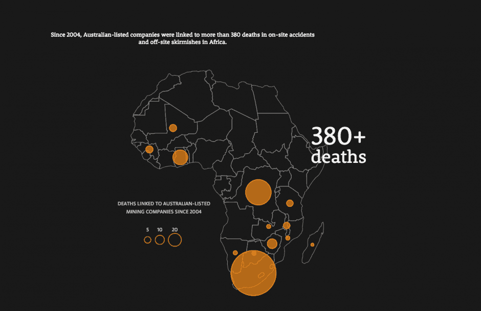
CZS: I’ve also received positive responses to the map of mining deaths in Africa. It provides the overview that proves the story isn’t limited to isolated anecdotes, but is pervasive across Africa. Our data reporter, Cécile Schilis-Gallego, did a lot of research to get that detailed count, and it shows.
EB: Fun fact: this is my first ever story that doesn’t contain footage of a dog. Puppies, baby goats and ducklings were filmed in the making of the FATAL EXTRACTION.
Q. What goes into a project like this? What should anyone attempting this know?
CZS: Prototyping early and often and getting as much real, actual content into the presentation as early as possible helped a lot. I only wish we did that sooner and more frequently. The systems we used that allowed non-technical editors to tweak content and preview it live were absolutely essential. We spent weeks refining the details and probably could have spent weeks more, and that couldn’t have happened otherwise.
Q. What were your greatest challenges during the project?
EB: There were a number of challenges — from filming in Mali during an Ebola outbreak (and the subsequent 21 days of twice-a-day temperature taking and daily calls to U.S. health officials) to being forced to meet with sources in secret after being interrogated by Democratic Republic of Congo intelligence services who assigned us a minder. Then there’s the car in Malawi whose doors and windows didn’t open, that was funneling carbon monoxide into the back seat and eventually broke down entirely!
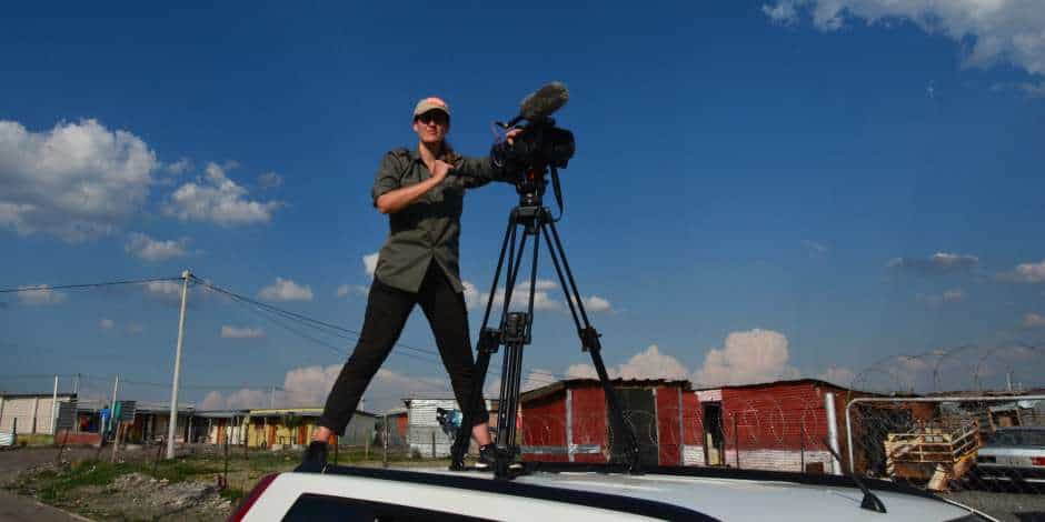
In terms of the production challenges though, the most fun thing was coming up with ways to capture (on very tight deadlines) events that had already taken place and of which there was little or no physical evidence. The idea to film the “dirt diagram” describing a protest in Mali in which villagers were killed, was inspired by a conversation I had with a local man who picked up a stick and began drawing to explain the location of a house. In this context, it seemed like the most natural way to tell the story of the shootings after the fact.
CZS: Definitely mobile was one of our greatest challenges. In addition to the work I did to make video work for mobile devices, design was also an issue. In the days before launch, we reviewed every slide on mobile devices and tried to make each work on the small screen. Sometimes the slide could be improved by moving elements, sometimes by rewriting the content and sometimes by using a different way of building the slide. Integrating all the technological, design and storytelling pieces into a cohesive whole was the hardest and most essential part.
Fatal Extraction was made possible thanks to the generous support of the Pulitzer Center for Crisis Reporting.

Join the conversation
Show Comments